Area 17
Logo
Creating La Gran Belleza was not just a design project; it was a deep exploration of identity, typography and layout. From the first sketch to the paper selection, each decision reflected a search for balance between the classic and the contemporary. This design journey not only shaped a magazine, but also became a love letter to editorial art.
Magazine «La Gran Belleza» – A Project of Passion and Design
From the very beginning, I knew this would be a special project. It wasn’t just about designing a logo, but also about layout design, branding, merchandising, and shaping the magazine’s entire visual identity. It was a comprehensive and, above all, deeply personal endeavor.
The Logo: A Journey of Exploration and Learning
The starting point was the logo—a much bigger challenge than I had anticipated. Designing for yourself is one of the hardest tasks: you can create countless versions, and none of them seem quite right.
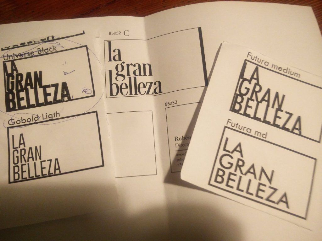
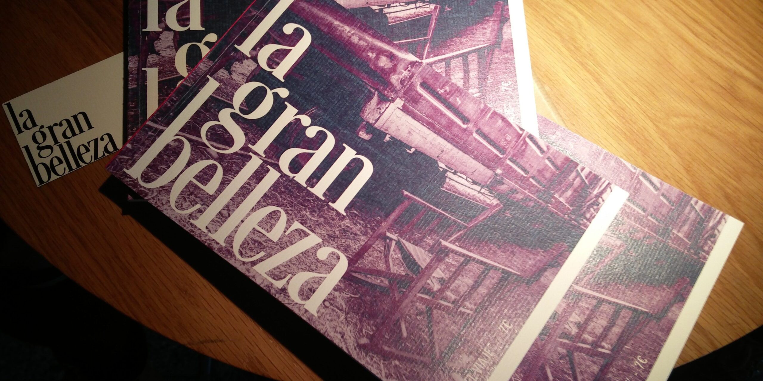
The only certainty was the landscape format, a tribute to Mafalda’s comic strips. Initially, I experimented with a handwritten typeface, but it quickly proved impractical due to poor legibility. So, I turned to geometric Bauhaus-inspired fonts like Futura, Gobold, and DIN—but none of them felt quite right.
I needed a fresh perspective, so I reached out to fellow designers. Christian, from Tosat Studio, suggested framing the logo to reinforce the format. I liked the idea, but in practice, the box felt too restrictive. After many iterations, I decided to keep only the right-side line, evoking the blinking cursor that writers constantly see on their screens—a perfect symbol for a literary magazine.
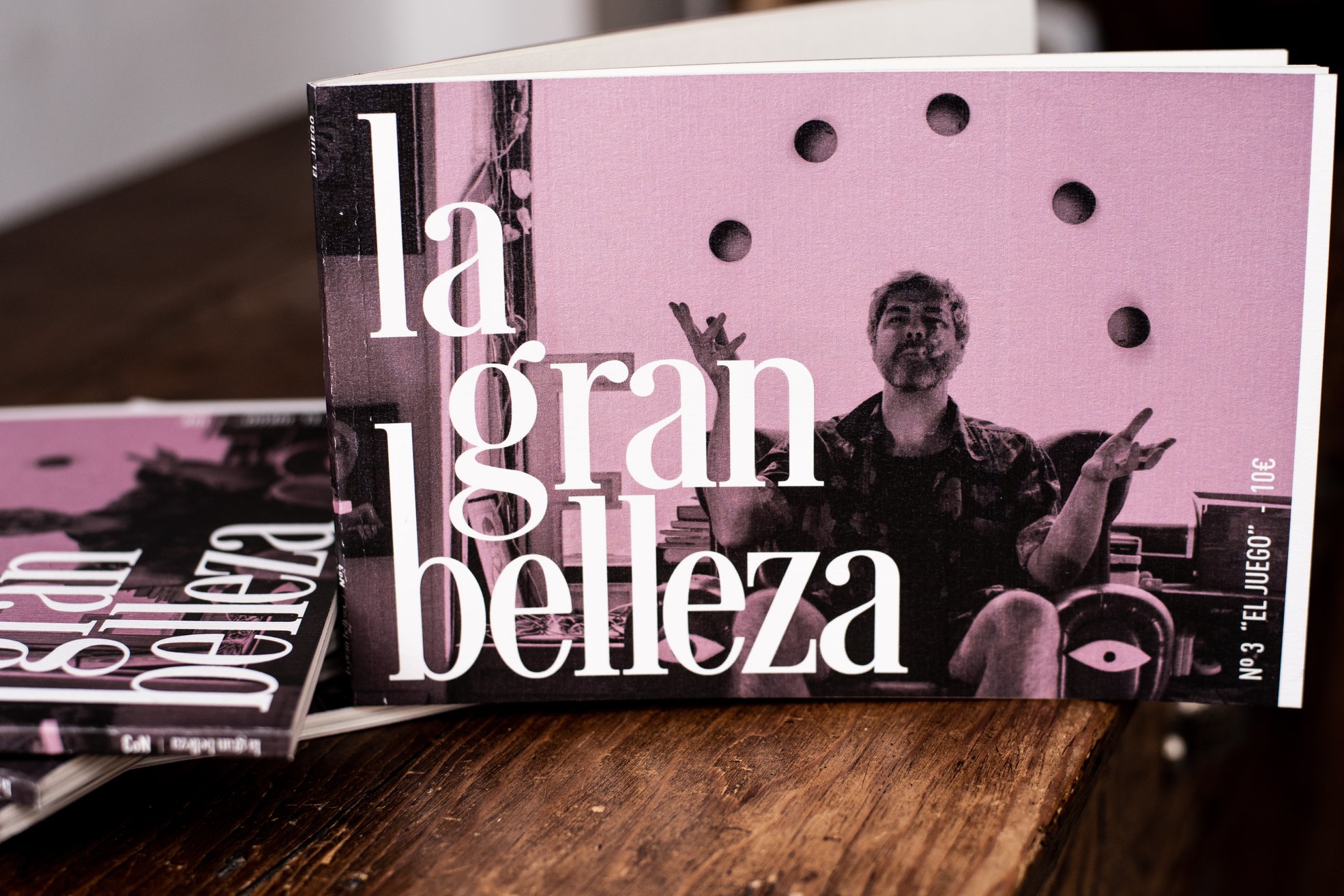
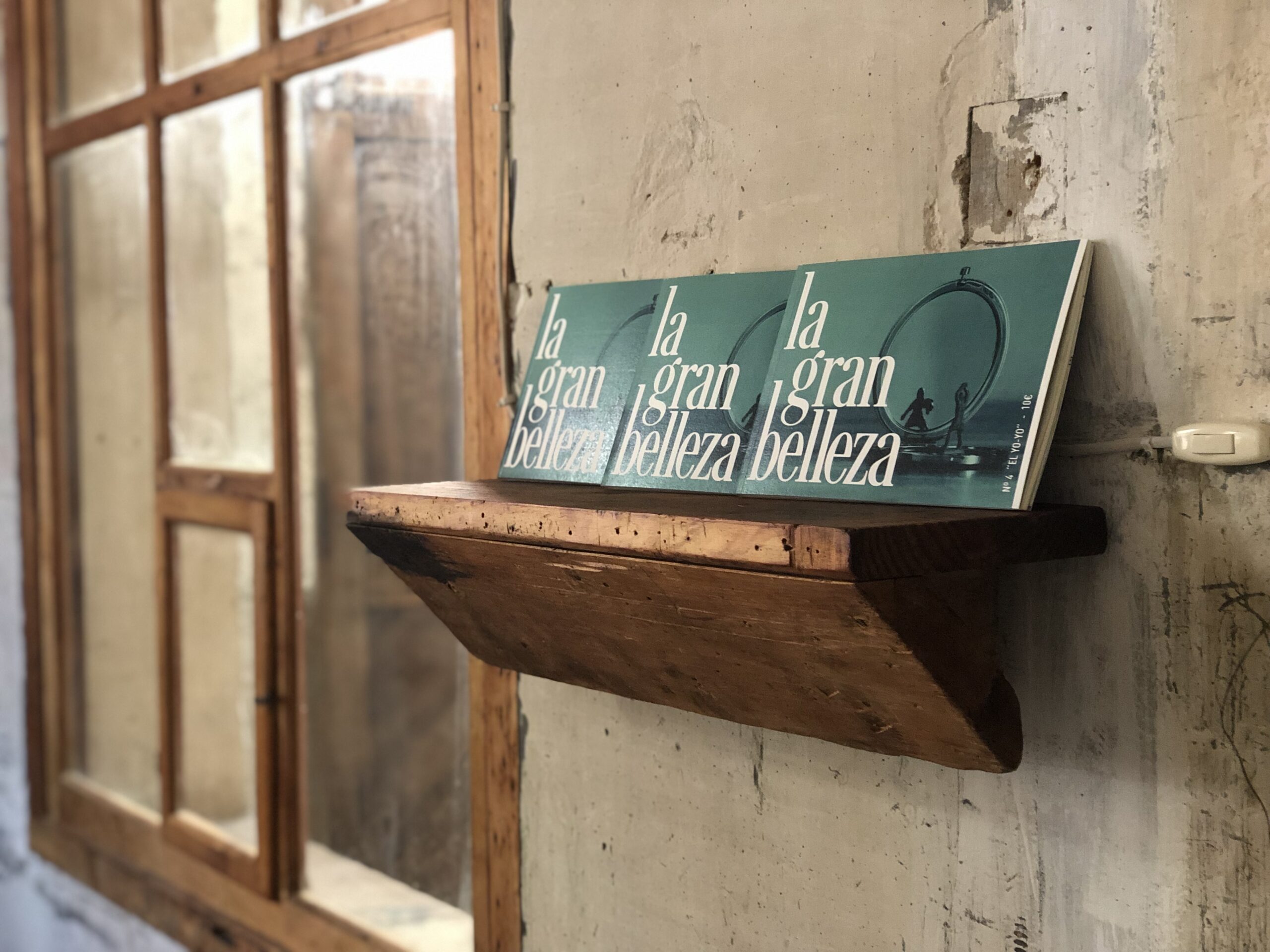
Still, I wasn’t completely satisfied. During a trip to Donosti, I visited Miguel Cazo (Miandku), an old friend who had transitioned from art direction to ceramics. He hadn’t seen the logo before and brought a completely fresh take: a classic and elegant typeface reminiscent of old books. We played around with different fonts until we found Desire, which had just the right personality. After fine-tuning the letter spacing and widths, the logo was finally complete.
Between the Fleeting and the Timeless
Now, we could focus on the magazine’s design. We wanted it to be horizontal and elongated, but above all, we wanted it to feel like a book. Touch is a crucial part of reading, one of the key differences between traditional books and eBooks. To capture this essence, we selected materials with character:
Textured laid cardstock for the cover
90g ivory paper for the interior, the same used in traditional books.
The printing method would be two-color offset, with a unique color combination for each issue. For the zero issue, we chose:
Pantone 280C (dark blue) for the main text
Magenta for highlights (ensuring accurate proofing on home printers)
But the most important element was still missing: the typography. We needed a font that would contrast with the classic logo. We opted for DIN Pro, a typeface designed in 1931 and still used in German road signs. For the body text, we wanted something even more traditional—something that evoked the books where these stories truly belonged. Goudy, an elegant American typeface from 1915, was the perfect fit.
The composition had to be clean and uncluttered. We used a 4×3 grid, which provided solid structure, improved readability, and allowed us to break up the flow of continuous text with strategically placed columns. The design is minimalist, keeping the focus on the text and illustrations. Only in key moments does it demand attention through blocks of color and an industrial typeface. This project was more than just design. It was a labor of love for books, a quest for balance between the classic and the contemporary, the fleeting and the timeless. As my grandmother used to say: “A little is enjoyable, but too much becomes tiring.” So I’ll stop here. But honestly, I could keep talking about this forever.
Creative Director, Brand Designer, Editorial Designer, Print Production Designer, Art Director , Visual Strategist. Transmedia Design Strategist , Teacher